
How to Read a Stock Chart for Beginners (Complete Guide)
A stock chart is simply a picture of price over time — but once you know how to read candlesticks, volume, moving averages, and a few key indicators, that picture starts telling a genuinely useful story about who’s in control, buyers or sellers. This is a complete, ground-up guide: what a chart actually shows, how to read a candlestick in five seconds, what volume bars are really telling you, the indicators worth learning first (moving averages, RSI, MACD), support and resistance, a full step-by-step practice walkthrough, and an interactive game to test your candlestick-reading skills.
Quick Answer
What a Stock Chart Actually Shows
At its core, a stock chart plots price on the vertical axis against time on the horizontal axis. Every chart you’ll see — whether it’s a simple line chart or a dense candlestick chart packed with indicators — is built on that same basic idea. What changes between chart types is how much additional information gets layered on top of that simple price-over-time relationship.
Beginners often make the mistake of thinking chart reading is about finding some hidden secret pattern that predicts the future with certainty. It isn’t. Chart reading is really about probability: recognizing recurring patterns in how buyers and sellers have historically behaved at certain price levels, and using that to make more informed — not guaranteed — decisions about risk and timing.
Chart Types
Chart Type Reader
Candlestick Basics
| Part | What It Shows |
|---|---|
| Body | The range between the opening and closing price for that period |
| Green/White Body | Closed higher than it opened — buyers were in control |
| Red/Black Body | Closed lower than it opened — sellers were in control |
| Upper Wick | The highest price reached during that period |
| Lower Wick | The lowest price reached during that period |
A single candle represents a fixed time period — one minute, one hour, one day, one week — chosen by whoever is viewing the chart. A daily chart made of candlesticks shows one full trading day’s price action packed into each shape: where the stock opened, the highest and lowest points it touched, and where it closed. Long bodies signal strong conviction in one direction; long wicks with small bodies signal a period where price was pushed hard one way and then rejected back — often a sign of an important turning point.
Reading Volume
Volume — usually shown as vertical bars beneath the price chart — measures how many shares traded during each period. It’s arguably the most underrated tool on a stock chart, because it tells you how much conviction is actually behind a price move. A stock breaking out to new highs on huge volume reflects broad participation and is generally seen as more trustworthy than the same breakout on unusually light volume, which can indicate a lack of genuine buying interest.
A useful habit for beginners: never read a price move in isolation from its volume bar. A sharp price drop on light volume might just be a handful of sellers moving the market temporarily; the same drop on heavy volume suggests something more significant — institutional selling, a reaction to news, or a genuine shift in sentiment.
Key Indicators Worth Learning First
| Indicator | What It Measures | Common Use |
|---|---|---|
| Moving Average (50/200-day) | The average closing price over a set period, smoothing out noise | Identify the overall trend direction |
| RSI (Relative Strength Index) | Speed and magnitude of recent price changes, scaled 0-100 | Spot overbought (>70) or oversold (<30) conditions |
| MACD | The relationship between two moving averages | Gauge momentum and potential trend shifts |
| Volume | Number of shares traded per period | Confirm the strength of a price move |
You don’t need a dozen indicators cluttering your chart to make good decisions — in fact, most experienced chart readers actively avoid indicator overload. Moving averages tell you the trend, RSI and MACD tell you momentum, and volume tells you conviction. Combining just these two or three tools, rather than stacking ten indicators that often say slightly different versions of the same thing, is generally a more effective starting point for beginners.
Support and Resistance
Support is a price level where a stock has historically found buyers stepping in, stopping a decline. Resistance is the opposite — a level where sellers have historically stepped in, capping a rally. These levels form because market participants remember prior price action: investors who missed buying at a prior low often step in again if price revisits that level, and investors sitting on a loss from a prior high often sell as soon as they get back to breakeven, reinforcing that level as resistance.
When a stock finally breaks through a well-established resistance level on strong volume, that old resistance frequently becomes new support going forward — a concept traders call “role reversal.” Recognizing these zones is one of the most practical, immediately useful skills a beginner can develop, because it directly informs where to consider entries, exits, and stop-losses.
Read the Candle
Step-by-Step Practice Example
Start with the trend
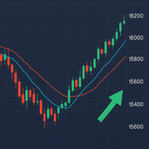
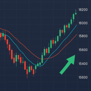
Zoom out first. Is the 50-day moving average above or below the 200-day moving average, and is price above both? This single check tells you the dominant trend before you look at anything else.
Check recent volume
Has volume been expanding or contracting over the past several sessions? Rising volume alongside rising price confirms genuine buying interest; rising price on falling volume is a weaker signal worth watching closely.
Identify the nearest support and resistance
Look left on the chart for the most recent price levels where the stock reversed direction more than once — these are your working support and resistance zones for the current setup.
Check RSI for overbought/oversold
An RSI above 70 suggests the stock may be due for a pause or pullback; below 30 suggests it may be due for a bounce — useful context, not a standalone buy or sell signal on its own.
Put it all together
A stock in an uptrend, holding above its moving averages, showing rising volume on up days, and pulling back to a known support zone without RSI being extremely overbought, represents a much stronger overall picture than any single one of these signals alone.
Common Beginner Mistakes
1. Reading Price Without Volume
A price move that looks dramatic on the chart can mean very little if volume is thin — always check both together, not price in isolation.
2. Overloading the Chart with Indicators
Stacking ten indicators onto one chart usually creates conflicting signals and decision paralysis rather than clarity — start with a moving average, RSI, and volume, and add more only once you’re comfortable with those.
3. Ignoring the Broader Market
An individual stock’s chart doesn’t exist in a vacuum — a bullish setup on a single stock is far less reliable if the overall market or sector is in a strong downtrend at the same time.
4. Treating Patterns as Guarantees
Chart patterns describe probabilities based on historical tendencies, not certainties — even well-formed setups fail a meaningful percentage of the time, which is why risk management (position sizing and stop-losses) matters as much as the chart-reading itself.
FAQ — People Also Ask
Key Takeaways
Reading a stock chart comes down to combining a handful of core skills — recognizing the trend, reading candlesticks, checking volume for confirmation, and identifying support and resistance — rather than memorizing dozens of indicators.
Where to start: Practice on charts you already know well, focus on trend + volume + one momentum indicator before adding complexity, and always treat chart signals as probabilities to weigh, not certainties to act on blindly.